The station is the starting point and destination of each journey. Life comes and goes, stop and go, I hope that the different station landscape can make every journey of your journey full of poetry. In the station landscape, we can appreciate the romance and joy of the starting point and destination.
Japan CoFuFun Station Square
CoFuFun Station Square is located at Tenri Station in the Nara area near Kyoto in western Japan. The master plan of the square was designed by nendo, which is their first foray into the field of public space.

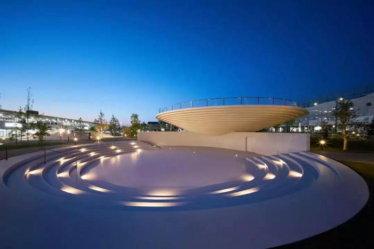
The planning and design of the 6,000-square-meter area includes a series of spaces such as bicycle rentals, cafes, shops, information kiosks, entertainment areas, outdoor stages and meeting spaces.

The goal of the project is to revitalize the local community by providing space for activities, tourism information dissemination, and leisure facilities for local residents, providing them with event venues, leisure facilities, and helping the local dissemination of tourism information to enhance attractiveness.


The surrounding area of Tenri City has some old Japanese tombs known as “cofun” by the locals. cofun is very beautiful, and the designer hopes to integrate them into the daily living space of the city. Therefore, the landscape design of the square is inspired by these “cofun”, which also symbolize the characteristic landforms of the region: the Nara Basin surrounded by mountains.
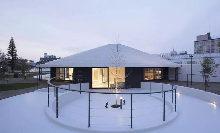
During the construction of the circular structure in the plaza, pizza-shaped concrete precast molds were assembled. At the same time, the mold can be reused to reduce the budget. The assembly of the prefabricated components used the large cranes used in bridge construction. Such designs can create large spaces without using structures such as columns or beams.


The circular shape ensures the stability of forces applied in all directions and provides a good balance for the space. The name of the square “CoFuFun” is a combination of the design theme “cofun” and Japanese spoken language. “Fufun” means happy, “CoFuFun” also means “co-” in “cooperation” and “community” and “fun” itself. Although it is the spelling of Japanese and English letters, it has a similar meaning, which can be easily understood by foreign tourists, and also expresses the meaning that the plaza aims to provide tourists with a reserved living space.
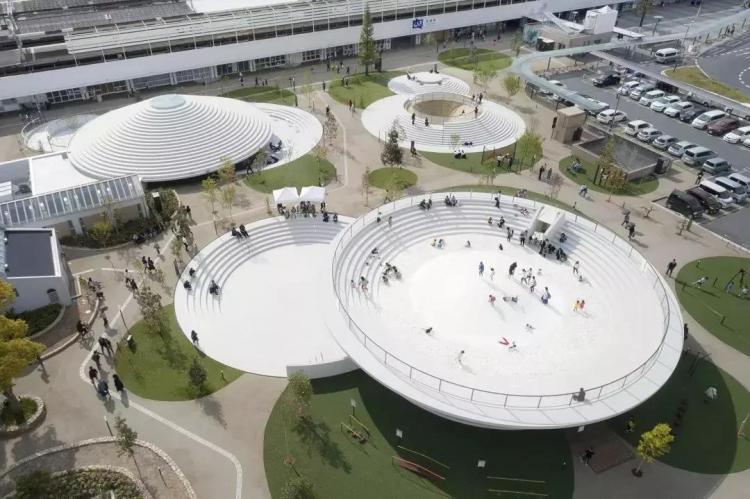
The different heights of the cofun structures serve a variety of functions: they are both stairs and seats, railings to protect children at play, roofs for cafés and stages, shelves for display and lighting at night. This variety creates an environment where people can explore and spend time in different spaces in the square, rather than a closed space. This is an “ambiguous” space, which can be a coffee shop, a square or even a huge piece of furniture.
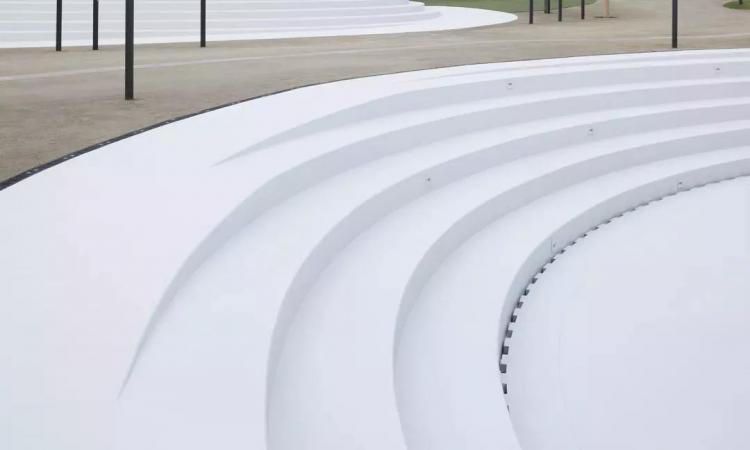
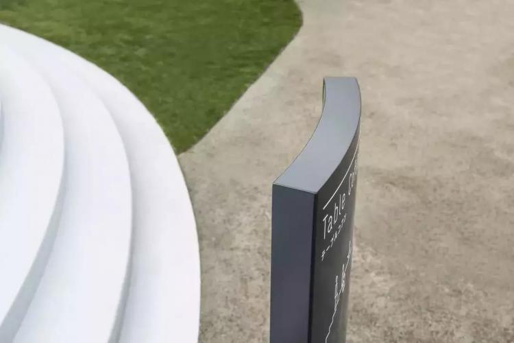
Road signs and billboards have soft curves similar to cofun, and the color is dark gray, which can keep eye-catching and blend well with the surroundings. The materials and colors of the interior space are designed to be consistent with the square. The furniture and installations use wood from Nara Prefecture, and use the same design language as the square around the theme of cofun.
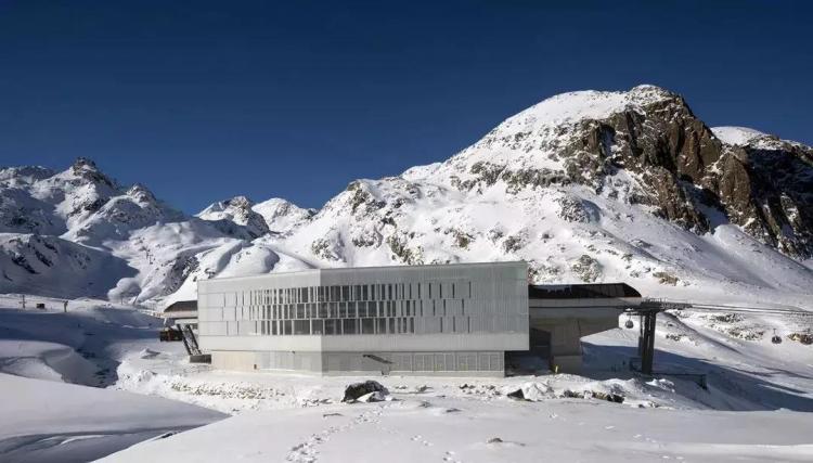
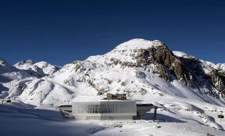
Cable car station at Stubai glacier rock peak in Austrian Alps
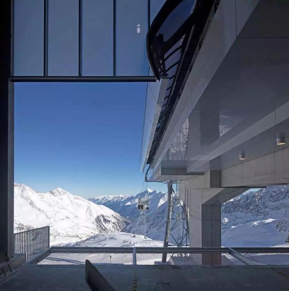
The project is three stops of the cable car, the three are far apart in the horizontal and vertical directions, and are in different terrains, without any other buildings around. According to the geographical location and corresponding functions, the designer set up three different architectural forms for the three stations. They are connected by cables, and the carriages on the cables become the extension of the buildings.
Abstract patterns cover the entire park floor, creating a sensual and visually artistic experience for those gliding through it. Soft shapes and curves are inspired by the arcs of skateboarders and cyclists on the ramp, while vibrant colors accentuate the undulations of the ground and make the space clearer.

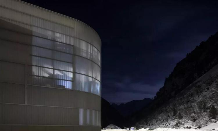
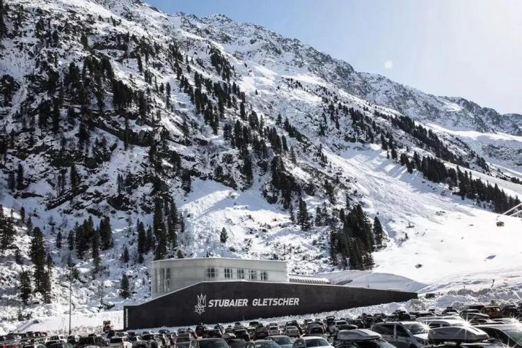
The valley station has the lowest elevation and is located by a fast-moving creek. The black concrete wall separates it from the stream and protects the station from avalanches on the opposite slope. The structure of the ticket office, administration room, sports goods store and distribution area is also made of solid concrete. The circular appearance of the station comes from the technical requirements of the cableway and is clad in low-iron mullioned glazing, partly transparent.


One side of the halfway station is connected to another cableway, whose shape is largely determined by the inclined line. In order to resist streams and avalanches, the ground floor area adopts a solid structure, and the glass facades with different transparency play the role of enclosure while providing people with a beautiful snow-capped mountain landscape.


The mountain top station, where tourists arrive at the ski area, is the core of Yanfeng Station. In addition to the station, the building also has many other functions.
Wodonga Junction Station Reconstruction Project in Australia
The Wodonga Junction Station project covers an area of 10 hectares and is one of the largest urban renewal projects in Australia. The state and local governments work together to inject new vitality into the Wodonga city center in the heart of northeastern Victoria.
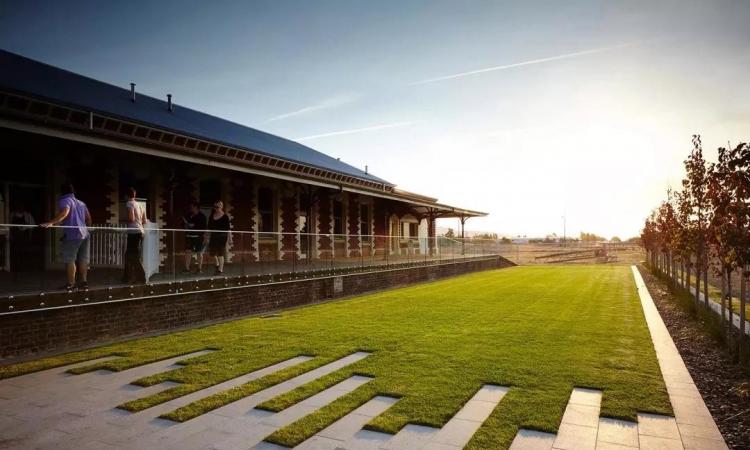
The reconstruction of the Wodonga Junction Station project focuses on the abandoned but historic Wodonga Railway Station and platform, aiming to create a variety of functional spaces such as public spaces, residences, businesses, and retail for residents in the surrounding communities.
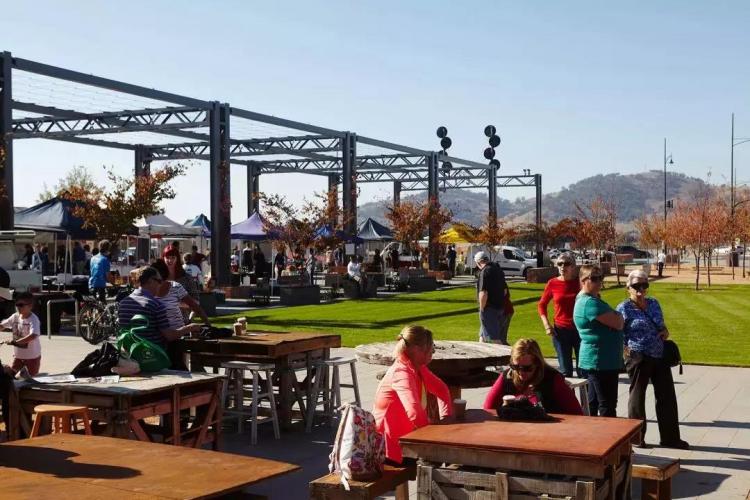
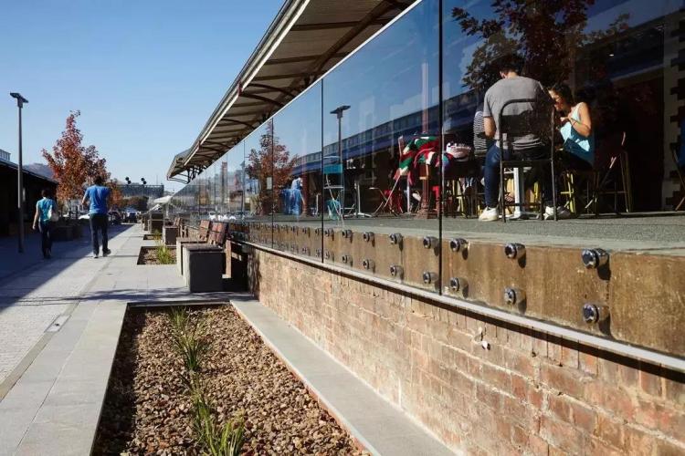
The designer takes the sustainable development of land resources as the leading principle of planning and design, retains and reuses the legacy railway infrastructure and materials, not only tells a rich rural history, but also redefines the humanistic spirit of the region, and promotes the city and community development.
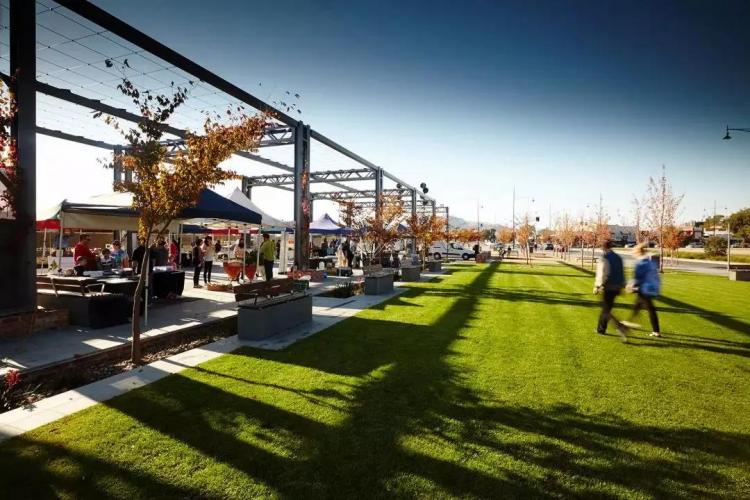

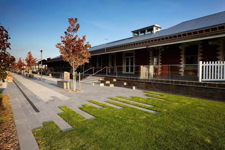
The design effectively integrates streets, public spaces and historical buildings, using materials recycled from the site, such as large stones, bricks, railway lamps, etc., and adding modern elements, such as glass handrails, lighting and water features, so that history and modernity are perfectly combined.
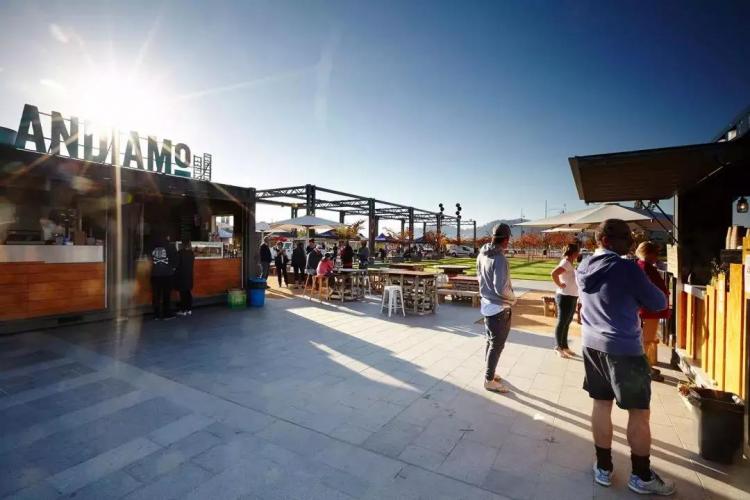
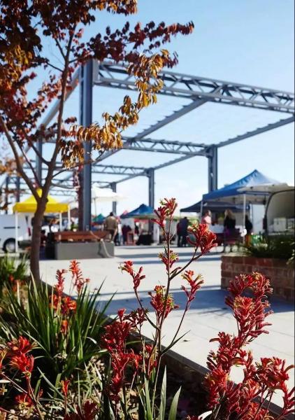

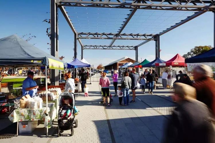
The design principle is to create a series of places that can meet the needs of community activities, such as markets, celebration squares and temporary coffee shops, which will be opened along the new “promenade” along the existing railway tracks.
Facing the main street of Wodonga City, there is a brand new urban green square with water features and pavilions transformed from railway bridge erecting machines. It is a green urban open space.
Amsterdam Central Station, Netherlands
As one of the two gateless passages running through Amsterdam Central Station, the Amsterdam Passage project is not only equipped with unique, simple and elegant shops and restaurants, but also creates a completely isolated environment from the hustle and bustle of commuters. Relaxation area.

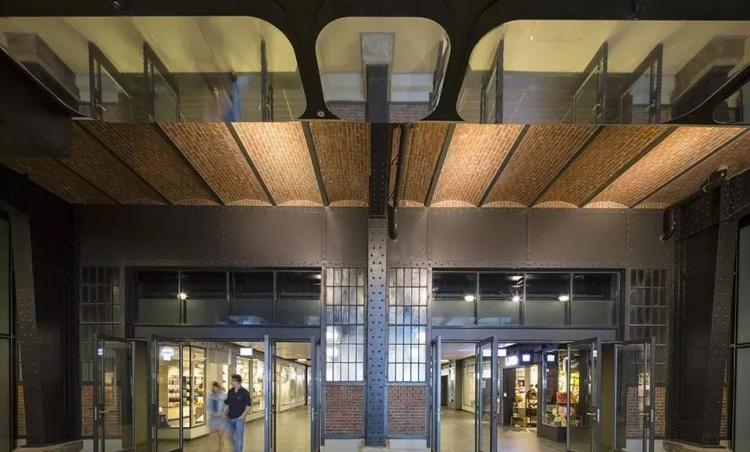
A selection of high-end retail outlets and a matching architectural style reflect the distinctive character of the corridor. Attracted by full-width LED introductory screens, escalators and stairs with brass corners, visitors are guided through three historic brick arches into the new 3,700-square-meter complex. In the underground shopping area. Modern and classic, tradition and high technology blend here.

The design of the passageway revolves around creating a luxurious and immersive experience through finely crafted details, ambient lighting, and comfortable ceiling heights. An additional champagne bar counter and exquisitely displayed items in the shop window also inject classic elements and different experiences into the passage.
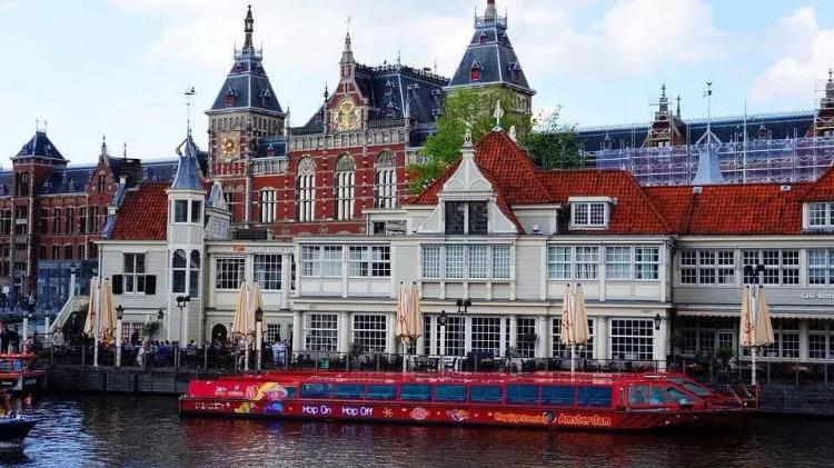
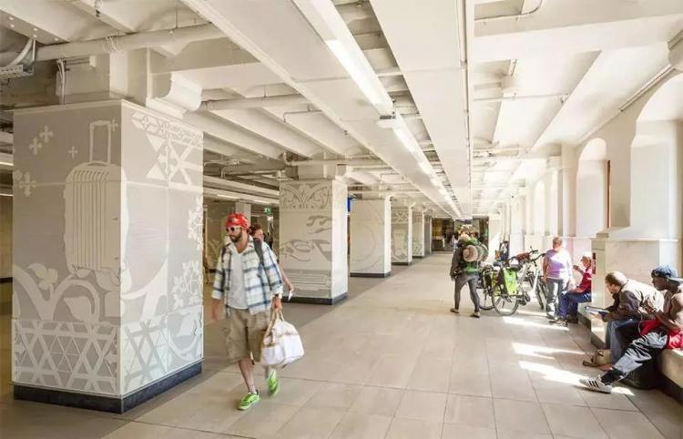
The central hall facing the IJ river district is lined with storefronts made of glass and wood or steel. These storefronts are inspired by the facade design of some old shops in the city center, aiming to arrange individual storefronts side by side closely to create a sense of unity and flow.

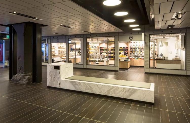
In addition, the designer also designed a set of specific color sequences to highlight the characteristics of each storefront. At the same time, the polished concrete lampposts with lantern-like lighting on the top and the custom-made StatuarioVenato marble seats dot the entire space along the central axis of the passageway. Chrome details, marble cladding and dark materials combine to create a romantic pedestrian street at night. Striking illuminated decorations composed of compressed glass on the lampposts also add a touch of 1920s Paris, France to the overall feel of the passage. The public seats with soft leather cushions also attract passers-by to sit down and relax all the time.
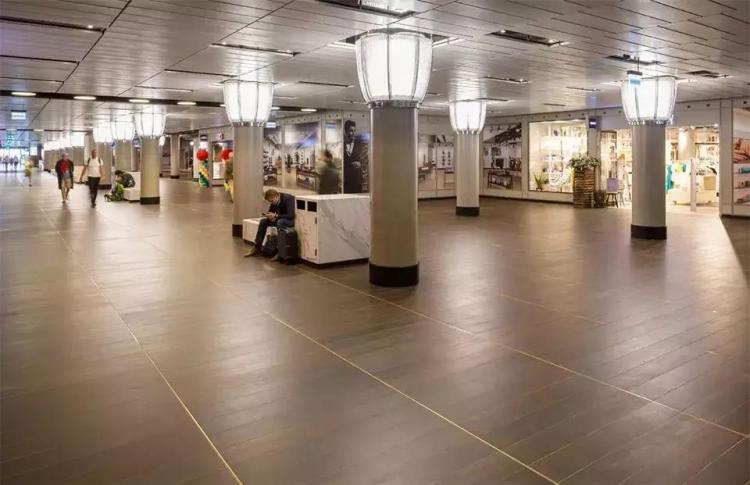
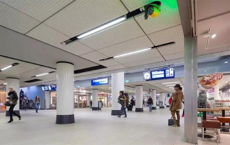
The corridor’s ceiling consists of large slabs detached from the walls, interspersed with canopy rafters already present in the station. In this way, the unique atmosphere of the train station continues to influence the passage. Consisting of specially made and lifted narrow strips, these ceiling slabs accommodate and hide various lighting, speakers and sprinklers from view, while eliminating the need for other panels to place these technical The hassle included.

The IJ aisle, the first aisle, will be dedicated to luxury and fashion clothing stores. Its dark floor finish creates an atmosphere and warmth unique to relaxation areas. The tiled pavement is finished with brass corners, giving the grounds depth, detail and charm.
Source: Internet media
Tidying Up: People Who Explore Travel
The picture comes from the network screening


